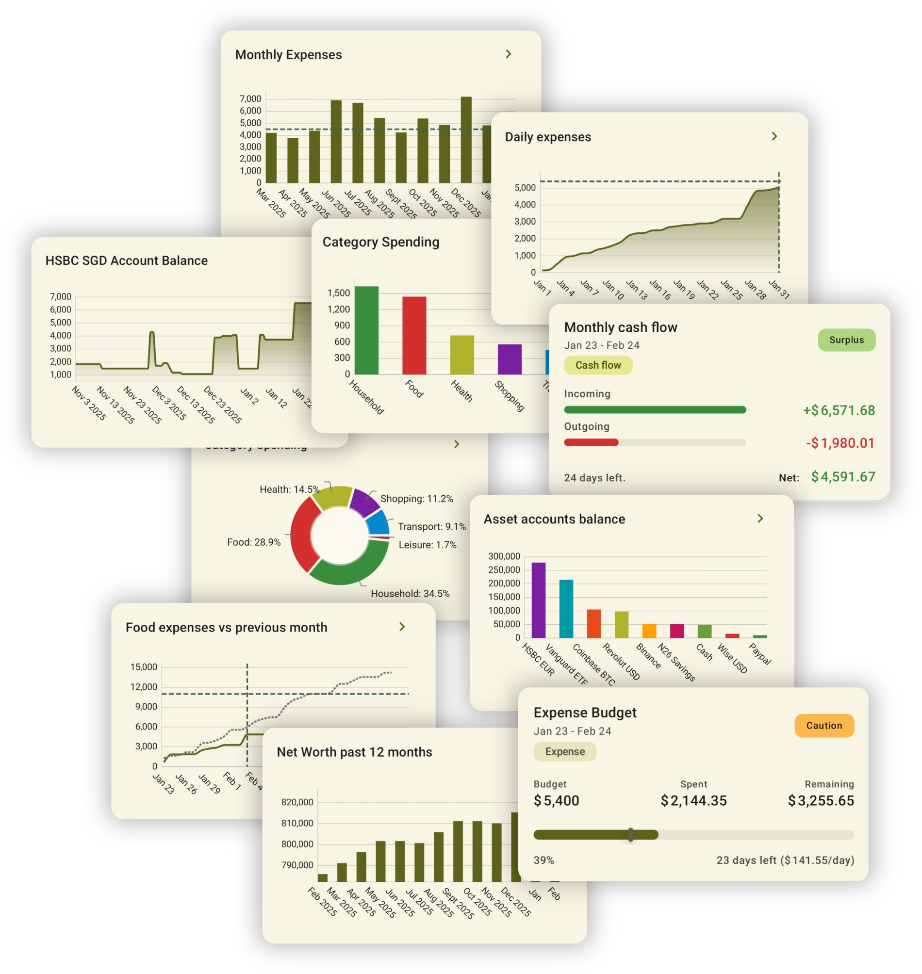
Build personalized chart-based analytics to answer any question about your finances — from daily spending patterns to long-term net worth trends.
Custom reports are BudgetViz's most powerful analytics feature. They let you build fully configurable, chart-based views of your financial data — answering questions like "how much did I spend on groceries each month this year?", "what does my daily cash flow look like compared to last month?", or "which accounts hold the most of my net worth?".
Every custom report combines a visual chart with the underlying transaction list that drives it. You control what data goes in, how it's grouped and visualized, and over what time period. You can start from one of the many built-in templates or build a report entirely from scratch.
Once you've configured a report that's useful to you, you can save it to your dashboard for quick access — turning BudgetViz into a personalized financial analytics dashboard that shows exactly the metrics you care about.
Custom reports are separate from budget and portfolio reports. Budgets and portfolios each have their own dedicated reports accessible from within those features. Custom reports are independent — they're flexible, general-purpose analytics that you define yourself. They can cover cash flow, expenses, income, net worth, account balances, recurring transaction analysis, and more.
Every custom report is displayed as a full-screen view with three main layers stacked vertically. This layout is consistent whether you're viewing a report from the main transactions tab or in its own dedicated screen.
The time period navigation bar sits at the top. If your report uses a recurring time period (like monthly), you can swipe or tap the arrows to move to the previous or next period. The chart and transaction list update automatically as you navigate.
The chart visualizes the report data according to your chosen chart type and grouping strategy. Tap on chart elements to see details, or use the chart configuration button to change how data is visualized.
The transaction list shows every transaction that contributes to the chart above. This makes it easy to verify the data behind any pattern you spot — you can tap any transaction to view or edit its full details. You can also perform batch operations by long-pressing to select multiple transactions at once, letting you change categories, accounts, tags, descriptions, delete, or duplicate in bulk.
Chart and list are always in sync. The transaction list always shows exactly the data that powers the chart. If you filter, change the time period, or adjust chart grouping, both the chart and the list update together. This makes custom reports not just a visualization tool, but also a powerful way to find and manage specific transactions.
Every custom report is shaped by four independent groups of settings. Together, they determine exactly what data is included, how it's grouped, how it's visualized, and over what time period. You can access each through the toolbar at the top of the report view.
The overall date range for the report — recurring, fixed, or relative (e.g. "last 6 months").
Control which transactions are included by type, category, account, tag, status, and more.
Choose how data is grouped (daily, monthly, by category, etc.), which chart type to use, and display options like cumulative mode, goal lines, and comparison lines.
Additional settings like reporting currency and projections.
The time period defines the overall date range of your report. It determines which transactions are included and sets the boundaries for the chart. Open the time period picker from the toolbar to change it.
A period that repeats on a regular cycle — like monthly or yearly. When you set a recurring period, the navigation bar lets you step forward and backward through each cycle. For example, a monthly period starting on the 25th will show the 25th to the 24th of the following month as one period. This is the most common and powerful option, especially when your billing cycles don't start on the 1st.
A rolling window relative to today — such as "last 30 days", "last 6 months", or "next 3 months". The window automatically shifts as time passes, so the report always shows the most recent data without needing manual updates.
A specific start and end date. Use this for one-off analyses — like reviewing a vacation period, a specific quarter, or comparing a particular date range across years.
Match your billing cycle. If your salary arrives on the 25th, set your recurring period to start on the 25th. This way, each "month" in your reports aligns with your actual pay cycle — giving you a much more accurate picture of your monthly cash flow.
Filters let you narrow down which transactions are included in the report. By default, a report includes all transactions within the selected time period. Adding filters lets you focus on exactly what you want to analyze. The filter badge in the toolbar shows how many filters are currently active.
Include only expenses, only income, only transfers, or any combination.
Focus on specific spending or income categories — like Food, Transport, or Salary.
Limit the report to one or more specific accounts.
Filter by transaction tags — useful for tracking projects, trips, or any custom grouping you've defined.
Filter by payment status: paid, upcoming, overdue, recurring, non-recurring, or skipped.
Search within transaction descriptions to find specific merchants or keywords.
Filters can be combined freely. For example, you could create a report that shows only food expenses from a specific account, or only overdue recurring transactions across all accounts. The non-recurring status filter is particularly useful for isolating variable, one-off spending from fixed recurring commitments — handy for budgeting and understanding discretionary cash flow.
Filters apply to both chart and list. When you add or change filters, both the chart visualization and the transaction list update simultaneously. This makes filters a powerful tool not just for analytics but also for finding and managing specific groups of transactions.
The chart configuration controls how your data is grouped and visualized. It has two main aspects: the grouping strategy (how transactions are bucketed) and the chart type (how those buckets are displayed). Open the chart configuration dialog from the chart area to change these settings.
Grouping determines how transactions are organized into data points on the chart. There are two families of grouping strategies: time-based and attribute-based.
Splits the report's time period into smaller intervals — each interval becomes a data point on the chart. For example, a yearly report grouped by month will show 12 data points. You can group by day, week, month, or year, and optionally add a breakdown within each time bucket by category or account. The time-based grouping period is independent of the overall report time period, so you can have a yearly report grouped by week, or a quarterly report grouped by day.
Groups transactions by a property rather than by time. Each unique value becomes its own bucket on the chart. Available groupings include: by category, by subcategory, by account, by account balance, by transaction type, and by tag. For example, grouping by category on an expense-filtered report shows one bar per spending category.
Best for trends over time — daily cash flow accumulation, net worth growth, or comparing current vs. previous period.
Best for comparing discrete values — monthly totals, category breakdowns, or side-by-side account comparisons.
Best for showing proportions — where your money goes by category, or the share of each account in your net worth.
Line and bar charts work with both time-based and attribute-based groupings. Pie and donut charts are only available with attribute-based groupings, since they represent proportions of a whole rather than trends over time.
The chart configuration also includes a number of display options that control how chart data is calculated and rendered.
In line charts, cumulative mode shows a running total that builds up over the time period — useful for seeing accumulated spending or cash flow. When off, each data point shows only that period's standalone amount.
Adds a dashed comparison line to line charts showing how the current period compares to previous ones. By default, the line represents the average of your last 6 periods for a stable baseline, but you can change this in Settings → Dashboard → Comparison periods. The chart legend shows "Previous" when set to 1, or "Average (N periods)" for multiple.
Starts the chart from the actual account balance at the beginning of the period instead of from zero. This transforms a cash flow chart into an effective balance chart, showing where your balance actually stands throughout the period.
Displays a horizontal target line on the chart at a value you define. Useful for budget targets, savings goals, or income thresholds.
Invert flips the sign of all values — useful when you want expenses to appear as positive numbers. Absolute values removes signs entirely, showing only magnitudes.
When using a time-based grouping with a category or account breakdown, this displays bars side by side instead of stacked — making it easier to compare individual values across periods.
Overlays unpaid transaction amounts alongside paid ones to show projected totals. On line charts, a dashed line appears representing the combined paid + unpaid amount — it is only visible when it differs from the paid line. On bar charts, unpaid amounts appear as a stacked grey section on top of the paid portion. This is a powerful forecasting tool: use it to project your account balance at the end of the month, estimate total expenses in a budget period, or see expected income including scheduled payments that haven't arrived yet. See the Payment Status section for details on how paid and unpaid transactions work.
Experiment freely. Changing the grouping or chart type doesn't change your data or filters — it only changes how the same data is presented. Switching from a daily line chart to a category pie chart on the same data set can reveal completely different insights.
Report options provide additional control over how data is calculated. These are accessible from the report options button in the toolbar — a badge shows how many options are currently active.
If you have accounts in multiple currencies, you can choose which currency all amounts should be converted to for the report. By default, this is your home currency.
Enables projected amounts based on your recurring transactions. When active, BudgetViz dynamically generates projected occurrences of recurring series beyond the current unpaid anchor transaction, extending through the report's time period. This shows what your spending, income, or cash flow would look like if all scheduled transactions are fulfilled — giving you a forward-looking view alongside actual data.
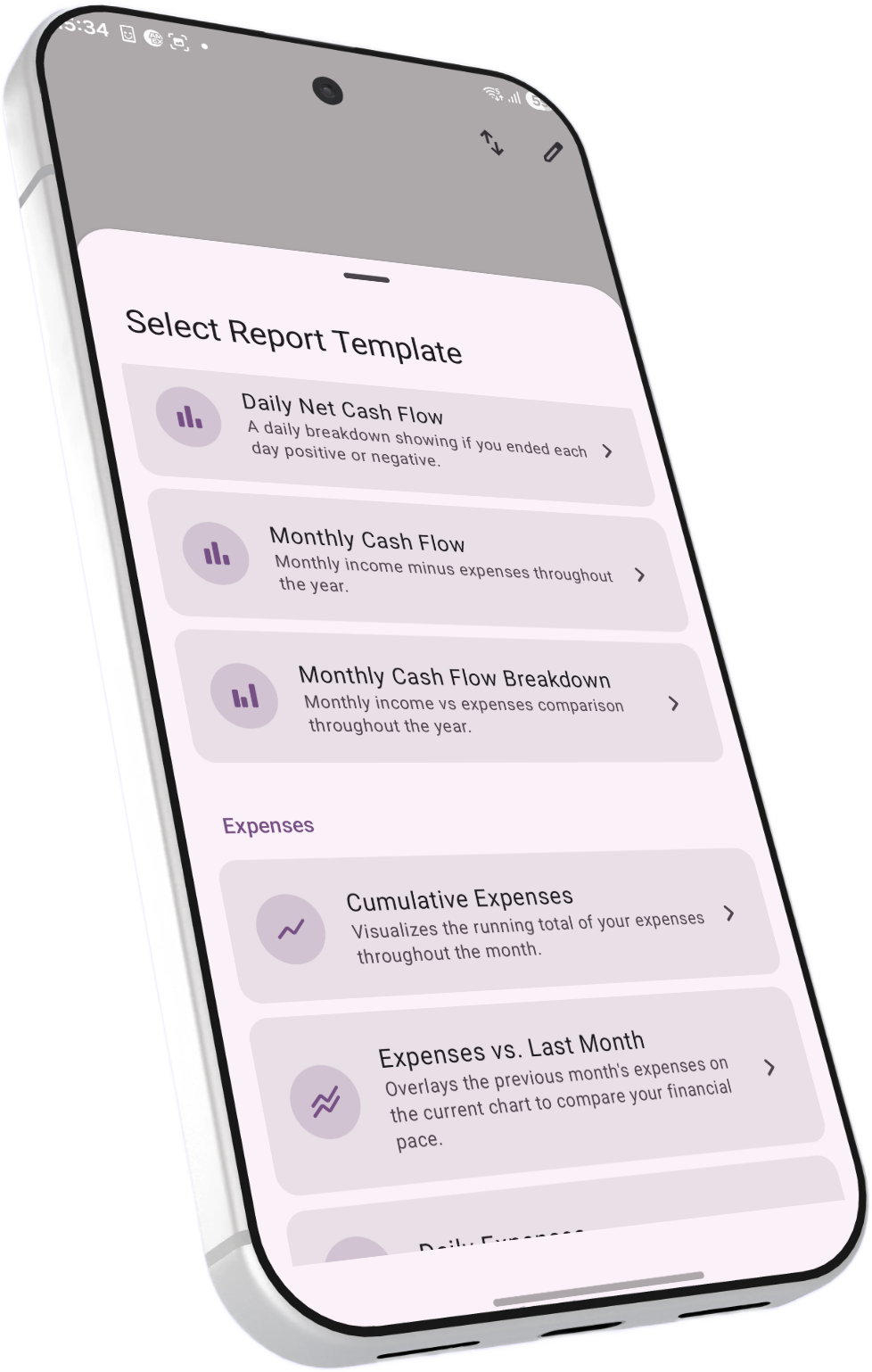
BudgetViz includes a large library of pre-configured report templates organized by category. Templates are fully functional reports with sensible defaults — you can use them as-is, or treat them as a starting point and customize every aspect before saving to your dashboard.
Here's a sample of what's available in each category:
Running total of all income and expenses, day by day — see your balance trajectory through the period.
Current period's accumulated cash flow overlaid with a comparison line based on previous periods — one previous period or an average of several, depending on your Comparison periods setting.
Bar chart showing total spending per category for the current month.
Proportional breakdown of where your money goes — one slice per category.
Compare income across your accounts month by month.
Track your total net worth over time, combining all account balances.
See how a specific account's balance changes day to day through the period.
All recurring expense subscriptions and bills, projected to their yearly cost.
Forward-looking view of upcoming scheduled expenses accumulated over time.
Templates are just a starting point. When you open a template, you can immediately modify any aspect — change the time period, add filters, switch chart types, adjust options — and then save the result. This means even if no template matches your exact need, you can usually find one that's close and tweak it.
Once you've built a report you want to keep, you can save it so it appears on your dashboard for quick access. Saved reports remember all of their settings — time period type, filters, chart configuration, and report options — so they load instantly with the right data every time.
Set the time period, filters, chart type, and any report options until the report shows exactly what you want.
Open the options menu and choose Save to store the report. You'll be asked to give it a title — pick something descriptive like "Monthly Grocery Spending" or "Net Worth Trend".
Your saved report now appears as a chart card on the dashboard. Tap it to open the full report view with all your settings intact, including the ability to navigate between time periods.
When viewing an existing saved report, the menu offers two options: Save updates the existing report in place with any changes you've made, while Save as Copy creates a new, separate report — useful when you want a variation of an existing report without losing the original.
Recurring time periods stay current. If your saved report uses a recurring time period (like monthly), it will always open to the current period — not the period it was saved in. This means your dashboard reports are always relevant and up to date without any manual intervention.
Custom reports are extremely flexible — here are some ideas for getting the most out of them.
Filter by a single account, use a cumulative line chart with the opening balance option enabled, and set a recurring monthly period. You'll see your actual account balance plotted day by day — one of the most useful reports you can build.
Use a daily accumulated line chart with the previous period comparison enabled. The two overlaid lines immediately show whether you're spending faster or slower than your baseline.
Use the recurring expenses template to see all recurring costs projected yearly. Sort by amount to quickly spot which subscriptions cost you the most annually — you might find some worth cancelling.
Tag all related transactions with the same tag, then create a report filtered to that tag. You'll get an instant overview of total costs and a breakdown of all associated transactions.
Filter for expenses only, group by category, and use a pie or donut chart. This is one of the most immediately useful reports — a clear visual answer to "where is my money going?".
Set a yearly time period grouped by month, with the account balance grouping strategy and opening balance enabled. Over time, this becomes a powerful visual record of your financial progress.
Filter by a single account, use a cumulative line chart with the opening balance and Include Unpaid options both enabled. The solid line shows your confirmed balance, while the dashed line shows where the balance will end up once all scheduled payments clear — perfect for checking whether you'll stay in the green.
Create an expenses-only report grouped by day with Include Unpaid enabled and a bar chart. Each bar shows the expected expense amount for that day, with the grey unpaid section indicating costs that are scheduled but not yet paid. Useful for spotting cash flow bottlenecks before they happen.
Build a personal dashboard. Save 3–5 reports that answer your most important financial questions and arrange them on your dashboard. Check them weekly or monthly — consistent monitoring is where the real value of custom reports lies.